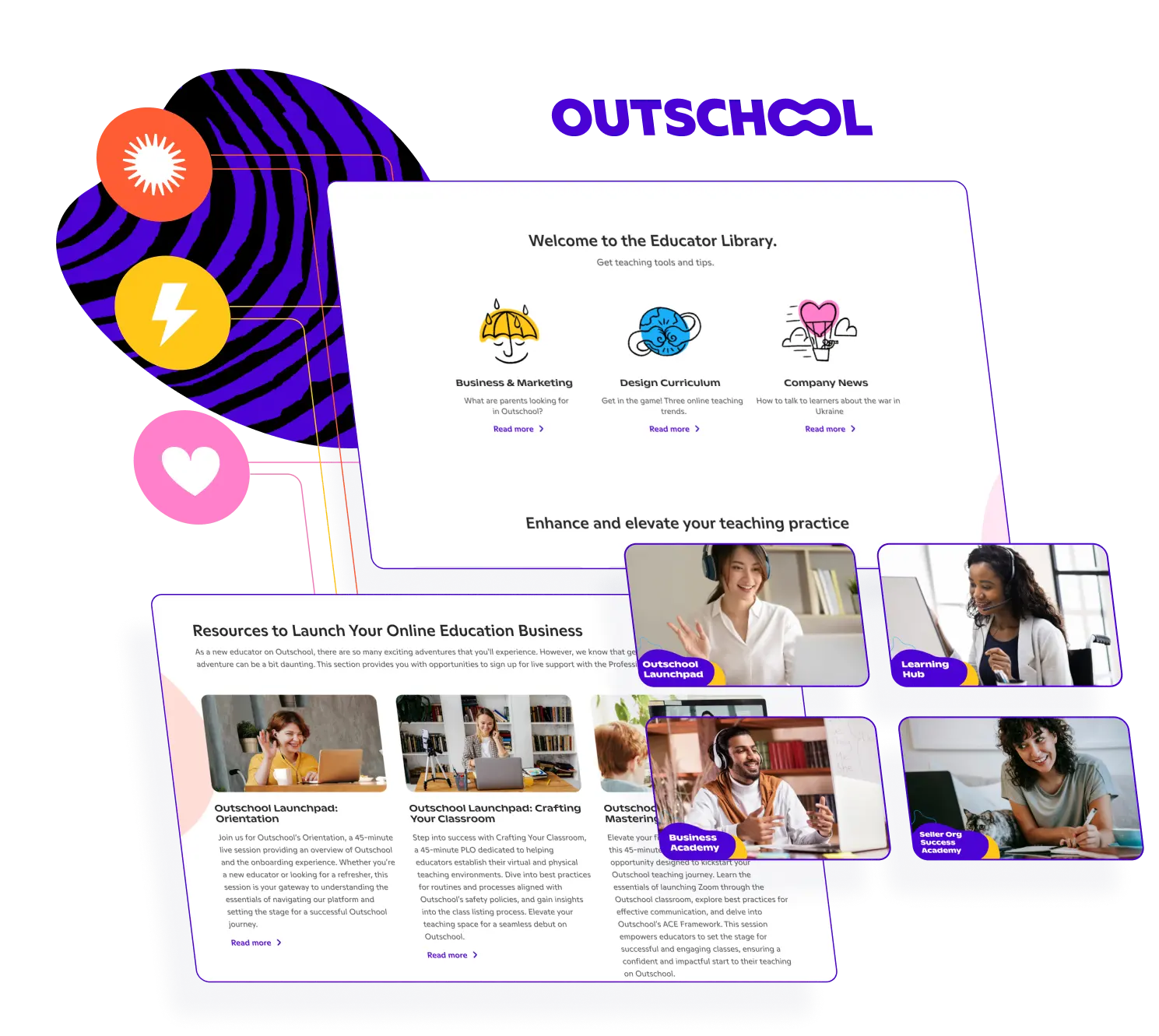
Our client, Outschool, approached us with a half-finished Figma design and web page template that required building. While they already had a main website, the virtual learning platform also needed a knowledge hub to train new teachers and provide easily-accessible resources. Thanks to our extensive experience with various rescue and design projects, Outschool chose Idea Maker to handle their new pages.

We evaluated the progress our client had already made, reviewing Figma assets and the Outschool website to better understand their brand and how the new pages would interact with their existing site. We then transferred their new page design from Google Sites and recreated it in Figma with their existing designs to develop an interactive prototype. Finally, by leveraging our expertise in building fluid, high-speed WordPress sites, we successfully developed their new Knowledge Hub with several additional pages.
We tasked one of our top designers with hooking up Outschool’s Figma design, creating an interactive prototype to share with their senior team. This allowed the Outschool team to accurately visualize the website’s functionality and interface, ensuring valuable development feedback.
When designing Outschool’s Knowledge Hub, we kept users in mind. By taking a user-first approach, we created a fluid user interface that provides a positive, pain-free experience and ensures easy access to teaching resources and learning materials.
We used WordPress to build the Outschool Knowledge Hub, as it provides an easy-to-use content management system that enables our client to make content changes themselves.
Idea Maker © 2026 ● All Rights Reserved