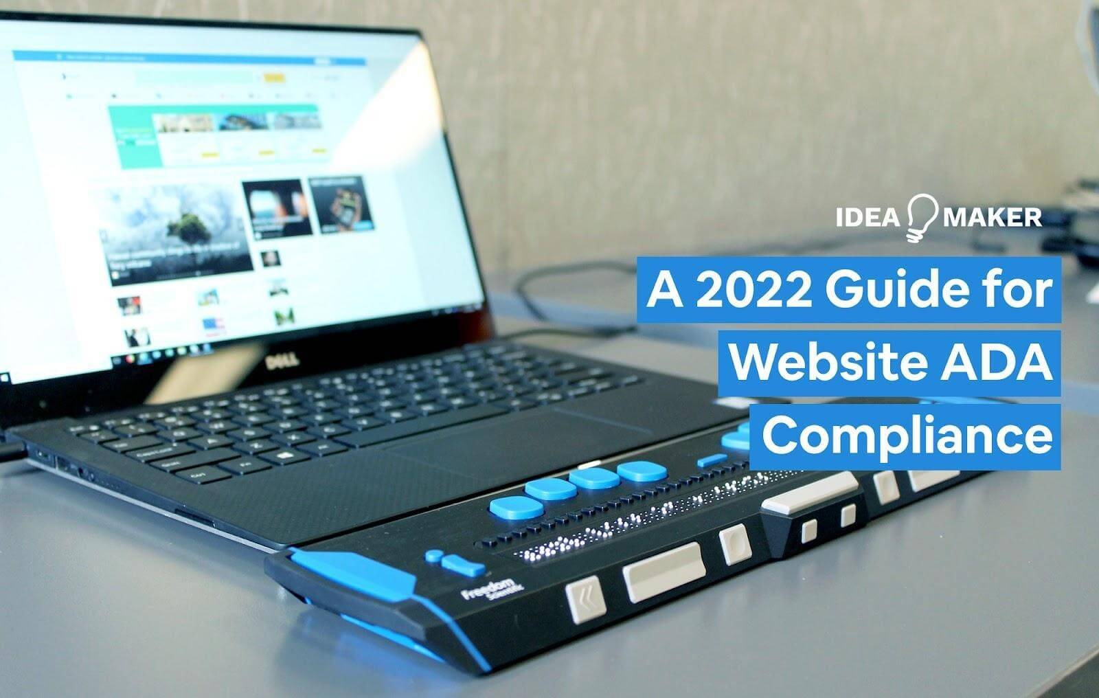
As technology and websites evolve, it becomes more and more important that companies ensure everyone can access their online content. Here we’ll learn about inclusive web design, why it’s essential, and what you need to have ADA Compliance on Websites.
Table of Contents
Why is ADA Compliance on Websites Important
Accessibility is necessary and should be employed by all. There are over 61 million adults affected by disabilities in the United States, which means 1/4 of the adults experience some disability. Those with disabilities are everywhere in our daily life in every city and country around the world. They experience the world differently from those without any disabilities, often in a negative way.
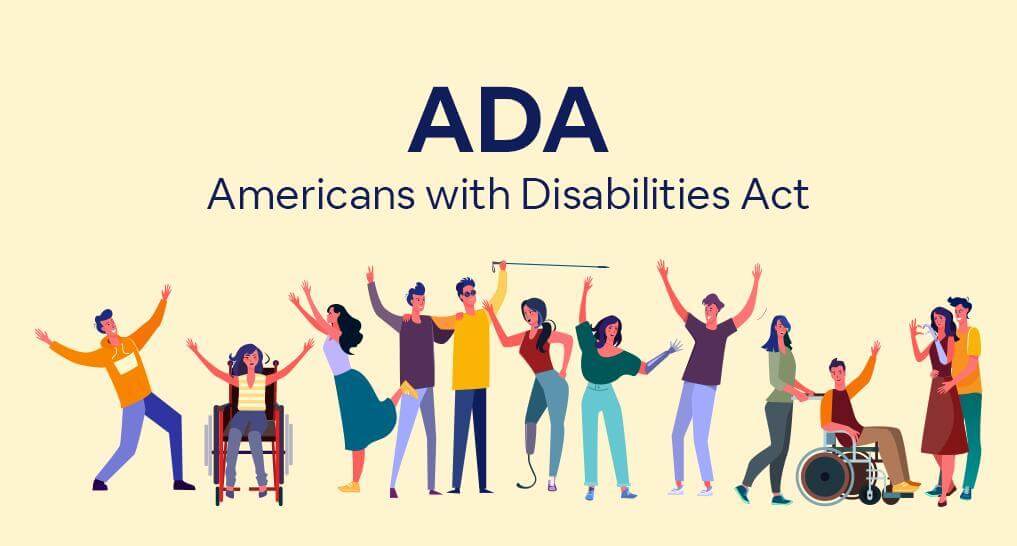
The Americans with Disabilities Act makes it unlawful for any business or government entity to provide goods and services without the necessary adjustments to ensure accessibility to people with disabilities. After observing the growing number of people with disabilities, the US Government passed this act to provide accessibility and a better quality of life to this previously neglected portion of Americans.
What is the Americans with Disabilities Act
Instituted in 1990, the Americans with Disabilities Act deals with discrimination against those with disabilities like deafness, blindness, intellectual disability, partial or total lack of limbs, or muscular dystrophy. It was based on the civil act right of 1964, which safeguards people against discrimination based on race, religion, and sex. However, ADA goes even further by demanding that organizations, governments, and companies provide reasonable accommodations to those with disabilities.
While ADA was created before the internet took off, its design is flexible enough to affect both physical and online businesses. Moreover, its places and public accommodations section ensures that even applications and websites are covered. As a result, many essential websites like BBC, Hilton, and Yokohama have adopted ADA, allowing people to shop, connect with others, share, and learn, all while under ADA’s protection.
What is ADA Compliance
ADA compliance refers to the Americans with Disabilities Act Standards for Accessible Design. Meaning technology, information, and services have to be accessible to people with disabilities.
While often mistaken with 508 compliance, ADA compliance is different. Although both Section 508 and ADA have the same goals, ADA has a broader spectrum, including schools, public transportation, workplace, and businesses open to the general public.
ADA compliance works side-by-side with the Web Content Accessibility Guidelines (WCAG). While not mandatory, it’s a set of carefully built guidelines that help designers improve ADA Website Compliance with the purpose to ensure digital accessibility.
How to Make aCan You Ensure Your Website is ADA Compliant?
Making your website more accessible without proper guidance can prove quite tricky and time-consuming. Thankfully, there are website accessibility guidelines from the Web Accessibility Initiative, which provides business owners with all the direction they need to improve accessibility. Let’s look into a few essential changes.
Titles, Headings, and Tags
Users with visual impairments use screen reader software to navigate websites. By using proper headings, screen readers can help users navigate websites and their elements more efficiently. So using headers like H1, H2, and H3 instead of just using italic, bold, and font sizes greatly aid users and software alike.
All headers should adhere to a hierarchy, with H1 being used for titles, H2 for new subjects, and H3 to expand subjects on H2. This structure makes it easier to read with screen readers and for users to skim through content.
Avoid Complex Fonts and Formatting
Avoiding complex and difficult-to-read fonts should be a priority when writing. The simpler, the better. Fonts like Sans serif and Arial are good examples of accessible options. But using a lot of bold, italic, and strikethrough can be problematic for people with low vision, so formatting must be kept simple and concise.
It’s normal for designers to envision their webpage in specific ways, employing code that ensures every user sees the website equally. However, when aiming for ADA Website Compliance, designers must include ways for users with low vision to change font size, font color, and website background color. These users often use high contrast settings and larger fonts.
Use Valuable Alt Text on Images
Screen readers can only interpret texts. Information like photos, images, graphs, color-coded text, or any purely graphical element won’t be accessible to visually impaired users. So a picture showing a store’s promotions for the week in the market is inaccessible to those using assistive technology to navigate your website.
The solution here is to use alt text in all relevant images in a webpage. This text is invisible for users, but it will be read aloud when a screen reader comes across an image with alt text in its HTML code. For this reason, the text should have a short, clear, and neutral description of the picture.
Alt text should be used with care by avoiding gibberish and file numbers. It’s also recommended not to use alt text for purely cosmetic images to avoid usability problems.
Natural Navigation Helps Users
How your website navigation is structured is another central point when implementing accessibility. “Skip links” can be used to aid users with motor and visual disabilities. Those who use screen readers or can’t use a mouse to navigate will be thankful for the ability to ignore navigation links and skip straight to a website’s relevant content.
A Floating button with alt text to go back to the table of contents is a great addition that will please most users and make the navigation feel more natural and accessible.
Use Descriptive Anchor Text in Hyperlinks
Instead of using generic statements such as “Click here” as anchor text for links to your website, using descriptive links such as “Visit the Idea Maker website” is better. Using descriptive links is a best practice for accessible web development, as they provide clear information about the page they’re about to load.
Descriptive anchors help visually impaired users quickly jump around the content of a page. It makes the context of a link clear without the need to thoroughly read a paragraph, making it much easier to skim pages for relevant content.
Avoid Strict Timed Elements
Users with motor disabilities will likely require more time to navigate your website properly. The issue here is that many sites employ unforgiving timed elements making users lose promotions, reservations, or information when a short-timer runs out. To increase accessibility, make sure that timers are forgiving, and if a timer expires, the user’s progress or information must not be lost.
Provide Documents in Accessible Formats
Governments will often post news, regulations, and other important documents in PDF format. While practical for most, PDF is an image-based format, making it often a poor choice as they make accessibility challenging for those with low vision or blindness.
A practical solution is always to offer alternative text-based formats, such as RTF (Rich Text Format) or HTML. Text formats ensure optimal compatibility with even the most basic assistive technologies in the market.
Videos Should Have Closed Captioning and Transcripts
Videos and multimedia get bigger by the day. As bandwidth becomes plentiful and connection speed rises, both companies and governments adopt video media to deliver messages, provide training, or communicate relevant information that would previously reach the user through text.
The issue here is that deaf or hard-of-hearing people will generally see the information presented on the web page, but they may have trouble hearing the video’s audio track. On the other hand, people with blindness or low vision won’t see the video but can follow the audio track. So websites need descriptive closed captions detailing the images and audio track of the video to solve this issue. It helps deaf and hard-of-hearing people by painting a better picture of what’s in the video and those with blindness and low vision by providing text that can be used with screen readers.
Another important step to increase website accessibility is ensuring every video has a transcript version of everything spoken in it. To make your transcript the best it can be, make sure it has descriptions about everything going on in the video, such as wind blowing and gestures.
Other Considerations to Improve Accessibility
If you want to reach AAA level Website ADA Compliance and ensure website accessibility to all users, you must keep some points in mind as you design your website. Here’s a list of essential points you should strive to address to increase your ADA compliance score.
- Avoid or reduce blinking and flashing by adding a pause option
- Include descriptive HTML tags on images and forms
- Add visual notifications when audio automatically starts
- Offer static copies of pages with lots of flashing or timed elements
- Make sure accessible coding is used in every webpage
- Ensure that users can change color and font on every commercial browser
- Draft a plan to ensure accessibility is implemented during development
Third-Party Technology and ADA Compliant Website Navigation
While some aspects of accessibility can be easier and quicker to implement, like color and font changes in a WordPress Blog, there are challenging aspects to accessibility when using third-party plugins, shopping carts, and floating lists.
If you don’t fully understand the Web Content Accessibility Guidelines (WCAG) and plugins you’re working with, trying to add a new accessibility feature can easily break another. Employing the proper third-party technology can save you time, money and allow your business to focus on content, growth, and marketing while knowing that the website will meet all the accessibility guidelines.
If you’re hosting a WordPress blog, this process can be streamlined using existing plugins like WAVE and Accessibility Suite. They run the website through a checklist to see what elements are not ADA compliant and offer suggestions to improve accessibility.
If you have your own website, you need to manually audit your website for ADA compliance or employ professional help to make your website compliant quickly.
ADA Compliant Website Design by Idea Maker
The number of customers with disabilities grows by the day, and businesses who strive to make their website ADA compliant can reap great benefits. ADA Website Compliance will improve the quality of your website, drive traffic up, and increase customer satisfaction.
Manually making your website ADA compliant can be an exhaustive process and doesn’t ensure you will get an AAA score. And considering websites are in constant flux by changing their looks or adding new functions, accessibility can get forgotten in these changes.
You can save time, money, improve customer retention, and focus on your product by contacting us at Idea Maker to make your website ADA compliant. We can even offer ADA compliance maintenance, ensuring your website is always the best it can be!


